Showing posts with label data. Show all posts

4.25.2016

Climate Econometrics

I have a new working paper out reviewing various methods, models, and assumptions used in the econometrics literature to quantify the impact of climatic conditions on society.  The process of writing this was much more challenging than I expected, but rereading it makes me feel like we as a community really learned a lot during the last decade of research. Here's the abstract:
Climate Econometrics (forthcoming in the Annual Reviews
Abstract: Identifying the effect of climate on societies is central to understanding historical economic development, designing modern policies that react to climatic events, and managing future global climate change. Here, I review, synthesize, and interpret recent advances in methods used to measure effects of climate on social and economic outcomes. Because weather variation plays a large role in recent progress, I formalize the relationship between climate and weather from an econometric perspective and discuss their use as identifying variation, highlighting tradeoffs between key assumptions in different research designs and deriving conditions when weather variation exactly identifies the effects of climate. I then describe advances in recent years, such as parameterization of climate variables from a social perspective, nonlinear models with spatial and temporal displacement, characterizing uncertainty, measurement of adaptation, cross-study comparison, and use of empirical estimates to project the impact of future climate change. I conclude by discussing remaining methodological challenges.
I summarize several highlights here.

12.17.2013

Landsat at your fingertips

The USGS has put together a slick GUI that let's you browse (as if it were GoogleEarth) and download Landsat data. The interface is described here.

One of my students found this and showed it to me. (Over the next few weeks, hopefully I'll be able to post much of the material and discoveries from my new course "Spatial Data and Analysis".)


9.18.2013

New GIS Data for the Demographic and Health Surveys

USAID's Measure Demographic and Health Surveys (DHS) are an extraordinary (free) data set on maternal and child health from around the world. They've just released their new spatial data repository which, among other things, adds crucial shape files of subnational region borders over time. From the official announcement:
We are pleased to announce the launch of a new open data GIS resource from MEASURE DHS.                                                                          
The Spatial Data Repository provides geographically-linked health and demographic data from the MEASURE Demographic and Health Surveys (DHS) project and the U.S. Census Bureau for mapping in a geographic information system (GIS).
-Boundaries of DHS regions can be explored to visualize change over time.
-Data from DHS indicators and U.S. Census population estimates can be downloaded in GIS format.
Please share with your colleagues and friends.
Go explore!  http://spatialdata.measuredhs.com/

6.03.2013

Weather and Climate Data: a Guide for Economists

Now posted as an NBER working paper (it should be out in REEP this summer):

Using Weather Data and Climate Model Output in Economic Analyses of Climate Change
Maximilian Auffhammer, Solomon M. Hsiang, Wolfram Schlenker, Adam Sobel
Abstract: Economists are increasingly using weather data and climate model output in analyses of the economic impacts of climate change. This article introduces weather data sets and climate models that are frequently used, discusses the most common mistakes economists make in using these products, and identifies ways to avoid these pitfalls. We first provide an introduction to weather data, including a summary of the types of datasets available, and then discuss five common pitfalls that empirical researchers should be aware of when using historical weather data as explanatory variables in econometric applications. We then provide a brief overview of climate models and discuss two common and significant errors often made by economists when climate model output is used to simulate the future impacts of climate change on an economic outcome of interest.

4.18.2013

1-800-CLOUD-GONE

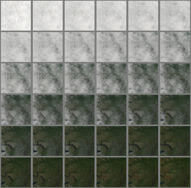
Ever been sitting by a window in the space station and feel annoyed that clouds are obstructing your view? Charlie Lyod and Chris Herwig of Mapbox (covered before on FE) have a simple but clever solution: sort your data by pixel.

Their explanation is clearer than mine (pun intended). I just wanted to post the pretty pictures.

Before:


After:


I think this idea has several applications beyond clearing the skies.

h/t Young

4.10.2013

Google search data for forensic epidemiology


Two recent papers have come out demonstrating that Google searches can provide extraordinarily rich data for forensic epidemiologists:

1.16.2013

REDD Metrics

Marshall points us to reddmetrics.com, a neat blog/company that FE readers might appreciate:

Founded in early 2011, REDD Metrics, LLC, applies innovations in large-scale spatial data processing to questions in environmental and resource economics.
 The blog is sparse but has several cool posts. They also seem to working on some interesting long term projects:
Large-scale implementation of change detection algorithms
Employing the power of cloud computing to detect changes in earth systems using satellite imagery over wide geographic areas. 
Economic analysis of natural resource use and management
Identifying economic determinants of resource consumption. For example, how do interest rates or agricultural prices affect the rate of forest clearing in Indonesia? 
Predictive modeling of spatial processes
Using massive spatial datasets and cutting-edge spatial modeling techniques to predict the flow of environmental phenomena over space and time. 
Development of mobile apps to disseminate and collect environmental data
Enhancing on-the-ground natural resource management by syncing local field data with indicators from large-scale spatial datasets.

12.20.2012

Unleash your inner cartographer

In my work, I make a lot of maps. But they're usually just a single image and they're mediocre in terms of color-choice and design.  Mapbox is a product from a DC startup that can help us data-jockeys build svelte and scalable maps that integrate data from lots of sources. From their about page:
MapBox is a platform for designing and publishing fast and beautiful maps. We provide MapBox Streets, a complete customizable world base map, develop the powerful open source map design studio TileMill, make it easy to integrate maps into applications and websites, and support all of these tools on top of scalable, high-performance hosting. We've made MapBox developer friendly with an open API.
The development team has worked on all sorts of projects, from tracking elections to helping document hurricane damage. Their blog is also way cool.

h/t Young

11.30.2012

Help map agriculture in Africa


Lyndon Estes writes
I have been working with Kelly Caylor developing a crowdsourced crop mapping project that is ready for some user testing.  I have asked my network of friends to test it a bit, in the hopes that we can see how the system performs, and get some initial data to show at my talk on this project next week at AGU.  
His instructions:
Hello Friends, I am kindly requesting your help with a research project. Our goal is to use crowdsourcing + google satellite imagery to map crop fields in Africa. We have just developed our prototype, which connects users on Amazon's Mechanical Turk Service to our field mapping interface.  
So, if any of you had a few minutes to spare over the next few days and an Amazon account (it's very easy to register as a Mechanical Turk user if you have an account, and not much harder to get an Amazon account if you don't have one), I would be very grateful if you could join up and map a few fields. The link below is to our website, which describes the registration and mapping process further.  
This project will be a for-pay endeavor within a few weeks, but for this stage when we are still working out bugs, we are going through Mechanical Turk's testing site (workersandbox.mturk.com), which pays fake money. Once you have registered, please go to sandbox to look for our HITs (Human Intelligence Tasks).  
Your help and feedback will be greatly appreciated, both for development purposes and for providing some data that I can include in my presentation on this project (Tuesday in San Fran).  
Thanks, Lyndon 
http://mappingafrica.princeton.edu/

10.12.2012

Global crop area data at subnational resolutions

Bob Kopp showed me a new data interface for global crop area-harvested assembled by the FAO (here). Not many crops have anything close to complete coverage, but this is strong progress. The site says the data are downloadable, but I haven't tried so I don't know how user-friendly it is.


9.28.2012

Crowd sourcing analysis of tropical cyclones via satellite imagery

Ken Knapp points us to cyclonecenter.org, a new program to crowd-source the analysis of global tropical cyclone records:

Climate scientists need your help classifying over 30 years of tropical cyclone satellite imagery. 
The global intensity record contains uncertainties caused by differences in analysis procedures around the world and through time. Scientists are enlisting the public because patterns in storm imagery are best recognized by the human eye. 
CycloneCenter.org is a web-based interface that enables the public to help analyze the intensities of past tropical cyclones around the globe. The global intensity record contains uncertainties caused by differences in analysis procedures around the world and through time. Patterns in storm imagery are best recognized by the human eye, so scientists are enlisting the public. Interested volunteers will be shown one of nearly 300,000 satellite images. They will answer questions about that image as part of a simplified technique for estimating the maximum surface wind speed of tropical cyclones. This public collaboration will perform more than a million classifications in just a few months—something it would take a team of scientists more than a decade to accomplish. The end product will be a new global tropical cyclone dataset that provides 3-hourly tropical cyclone intensity estimates, confidence intervals, and a wealth of other metadata that could not be realistically obtained in any other fashion.
I use these global records all the time, so I will be personally thankful to anyone who helps improve them.

6.18.2012

Only the finest in Swiss data visualiation

The data visualization specialists over at Chart Porn point us to Datavisualization.ch's Selected Tools page. From their blog post announcing it:
When I meet with people and talk about our work, I get asked a lot what technology we use to create interactive and dynamic data visualizations. [...] That’s why we have put together a selection of tools that we use the most and that we enjoy working with. We called it selection.datavisualization.ch. It includes libraries for plotting data on maps, frameworks for creating charts, graphs and diagrams and tools to simplify the handling of data. Even if you’re not into programming, you’ll find applications that can be used without writing one single line of code. We will keep this list as a living repository and add / remove things as technology develops. We hope this will help you find the best tool for your next job.
Guess it's time to learn a little javascript...

5.03.2012

Rockefeller 2012 Innovation Challenges

Anna points out that the Rockefeller Foundation (yes, that Rockefeller Foundation) has announced its 2012 Innovation Challenges.  They plan on awarding up to nine grants of  up to $100K for research proposals on the three following FE-appropriate topics:

  • Decoding Data - How will you use data to create change that improves the quality of life of poor or vulnerable communities in cities?
  • Irrigating Efficiency - How will you improve or scale agricultural water use efficiency?
  • Farming Now - How will your idea encourage and support young people to enter and stay in farming?
The deadline is May 25th, and applications are here.

2.29.2012

Ice loss and satellite measurement

There's a paper in last week's Nature showing new estimates of global glacial ice loss. The work is interesting in its own right (the authors estimate that glacial loss from several areas is lower than prior estimates, although the global total is similar) but I think it's particularly noteworthy for FE readers because it's a nice example of a paper using data from the GRACE satellites. If you don't know of the GRACE twins and need to be reminded of humanity's ability to produce amazing technological advancement, you might want to read this overview from one of the project sites:
As the GRACE-twins fly in formation over the Earth the precise speed of each satellite and the distance between them is constantly communicated via a microwave K-band ranging instrument. As the gravitational field changes beneath the satellites - correlating to changes in mass (topography) of the surface beneath - the orbital motion of each satellite is changed. This change in orbital motion causes the distance between the satellites to expand or contract and can be measured using the K-band instrument. From this, the fluctuations in the Earth's gravitational field can be determined. 
Here's an example of how it works. The two GRACE satellites are traveling in space, both 500 kilometers above the earth. As the front satellite approaches an area of higher gravity, it will be pulled toward the area of higher gravity and speed up. This increases the distance betweenthe two satellites. As the satellites straddle the area of higher gravity, the front satellite will slow down and the trailing satellite will speed up. As the trailing satellite passes the area of higher gravity, it will slow down and the lead satellite will not be affected. As the satellites move around the Earth, the speeding up and slowing down of the satellites will allow scientists to measure the distance between the two satellites, and, therefore, map the earth's gravity field.
A map of the Earth's gravitational field can in turn be used to infer mass changes driven by (for example) melting glaciers, changes in groundwater, or a variety of other phenomena, making GRACE useful for a wide variety of different research topics.

JPL's main site for the project is here, and a (long) list of publications using GRACE data is available here.

2.16.2012

BREAD Data

I just came across the Bureau for Research and Economic Analysis of Development (BREAD)'s list of data sources from developing countries. Not only is there an enormous amount, but much of it is free. Selected highlights:

Malaysian Family Life Surveys (MFLS)

conducted in 1976/7 and 1988 also contain extensive histories on employment, marriage, fertility and migration. Respondents in the first wave were followed in the subsequent waves; in the second wave, a refreshment sample was added. MFLS1 (1976/77) and MFLS2 (1988) are in the public domain. 

China Health and Nutrition Survey

The China Health and Nutrition Survey was conducted in 1989 and 1991 in 8 provinces in China and provides a wealth of detailed information on health and nutrition of adults and children including physical examinations. These data are available at UNC. 

Demographic and Health Surveys

More recent fertility, mortality and health data are available from Demographic and Health Surveys (DHS) . National which is DHS has been collecting national sample surveys of population and maternal and child health conducted in many developing countries since the 1980s. Data are currently collected under the umbrella of the Measure project which is administered by Macro International. Data have been collected in four waves:
    DHS-I (1986-90) 
    DHS-II (1991-1992) 
    DHS-III (1993-1997) 
    Measure (1998-present)
See the Measure DHS website for a list of countries that have been surveyed.
Yes, that last one is a personal favorite.

1.23.2012

spatial-analyst.net

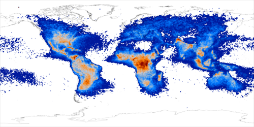
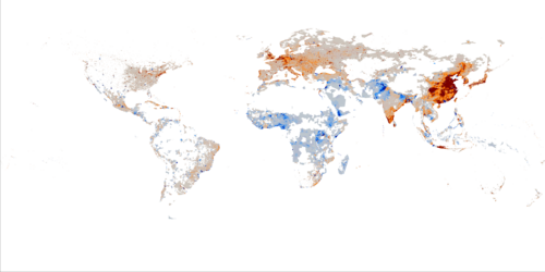
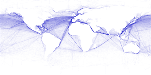
While looking for some remote sensing data last week, I ran into spatial-analyst.net, which I think deserves the FE-website-discovery-of-the-month award.  The wiki has pages dedicated to things like "How to download and resample MODIS images".  It's geared towards R users, and I'm kind of a Matlab guy, but it's still clearly useful to both parties.  For example, I really like their page pointing to various global datasets, some interesting examples of which are here:

Lighting flash rate
Second principle component of recent population density changes
Commercial shipping density
Carbon density tones of C / ha.
Estimated travel time to major cities (>50k) in hours

12.02.2011

Conflict News

A new paper finds evidence to support the "rapacity" or "prize" mechanism as an important factor driving civil conflict.

The Peace Research Institute of Oslo has released a gridded version of it's conflict dataset PRIO-GRID 1.0 (h/t Kyle)

The Office of the Under Secretary of Defense released a report on Trends and Implications of Climate Change for National and International Security, including recommendations for next steps.

11.09.2011

How do I find climate data for my research?

Once every three weeks a colleague (usually in the social sciences) emails me to ask about whether a climate data set of type X exists or what the pros/cons of various datasets are. I'm always happy to help, but it's useful to  know that there are multiple websites that maintain collections of various kinds of climate/global environment data, and several have pages that specifically compare the array of data sets out there.  If you're looking for data, a few clicks through these sites will give you a good sense of what's available.

All of these sites are listed in our meta-resources page.

10.31.2011

A picture is worth a thousand lives

Kristof's article
I am a strong proponent of spending time on figures, tables and presentations so that important ideas are communicated clearly and succinctly.  The story of this  internal letter written by Nicholas Kristof to his colleagues at the New York Times is a good example of why.
From: Nicholas Kristof 
Subject: the power of art 
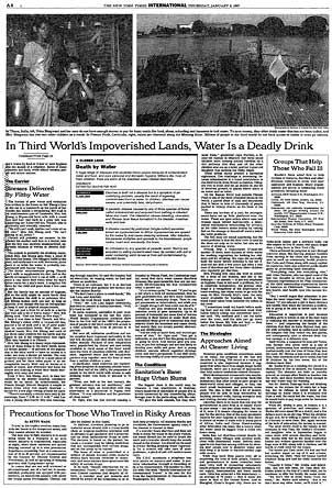
in september i traveled with bill gates to africa to look at his work fighting aids there. while setting the trip up, it emerged that his initial interest in giving pots of money to fight disease had arisen after he and melinda read a two-part series of articles i did on third world disease in January 1997. until then, their plan had been to give money mainly to get countries wired and full of computers. 
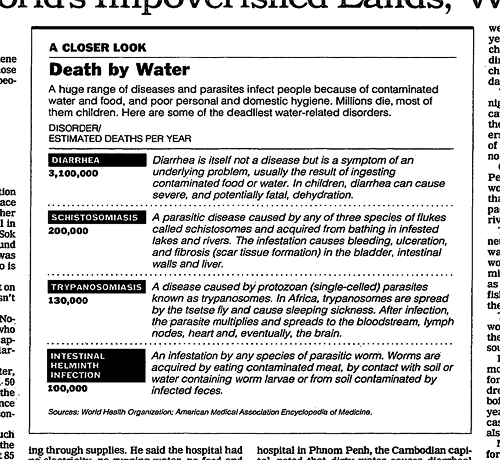
bill and melinda recently reread those pieces, and said that it was the second piece in the series, about bad water and diarrhea killing millions of kids a year, that really got them thinking of public health. Great! I was really proud of this impact that my worldwide reporting and 3,500-word article had had. But then bill confessed that actually it wasn't the article itself that had grabbed him so much -- it was the graphic. It was just a two column, inside graphic, very simple, listing third world health problems and how many people they kill. but he remembered it after all those years and said that it was the single thing that got him redirected toward public health. 
No graphic in human history has saved so many lives in africa and asia. 
I'm sending you a copy of the story and graphic by interoffice mail. whoever did the graphic should take a bow. 
nick kristof

The info-graphic/table that got Gates' attention.

Apparently, the letter itself is framed and hanging up in the office of the data graphics group at the NYT. h/t Pam.

9.14.2011

Volunteer data work and a data visualization contest

Two quick notes for code and stats -inclined Fight Entropy readers:
  1. Data Without Borders is holding their first event in New York next month. If you're an empiricist looking to do some good or an NGO in need of some data help, check them out here
  2. The team over at Information is Beautiful have announced a (recurring?) data visualization contest, The Information is Beautiful Awards
Both look potentially fun and rewarding.