 |
| Kristof's article |
I am a strong proponent of
spending time on figures, tables and presentations so that important ideas are communicated clearly and succinctly. The story of this internal letter written by
Nicholas Kristof to
his colleagues at the New York Times is a good example of why.
From: Nicholas Kristof
Subject: the power of art
in september i traveled with bill gates to africa to look at his work fighting aids there. while setting the trip up, it emerged that his initial interest in giving pots of money to fight disease had arisen after he and melinda read a two-part series of articles i did on third world disease in January 1997. until then, their plan had been to give money mainly to get countries wired and full of computers.
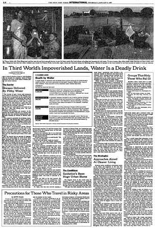
bill and melinda recently reread those pieces, and said that it was the second piece in the series, about bad water and diarrhea killing millions of kids a year, that really got them thinking of public health. Great! I was really proud of this impact that my worldwide reporting and 3,500-word article had had. But then bill confessed that actually it wasn't the article itself that had grabbed him so much -- it was the graphic. It was just a two column, inside graphic, very simple, listing third world health problems and how many people they kill. but he remembered it after all those years and said that it was the single thing that got him redirected toward public health.
No graphic in human history has saved so many lives in africa and asia.
I'm sending you a copy of the story and graphic by interoffice mail. whoever did the graphic should take a bow.
nick kristof
 |
| The info-graphic/table that got Gates' attention. |
Apparently, the letter itself is framed and hanging up in the office of the data graphics group at the NYT. h/t
Pam.
What I find interesting about this example is that the item in question is basically what you could call a "text box." It has no graphical elements in it other than the border separating it from the rest of the text. It makes no effort to visualize quantitative information other than to write down the numbers. This example speaks as much to the power of a good executive summary as to the power of a good graphic. I like good graphics as much as anyone, but this example shows that you can hit a home run with a powerful message and very simple layout choices.
ReplyDelete