Showing posts with label networks. Show all posts

11.14.2011

The Atlas of Economic Complexity

Chris Blattman points us to a new development econ data set / project / methodology : The Atlas of Economic Complexity. From Ben Ramalingam's interview with Cesar Hidalgo:
As readers will be well aware, the social accumulation of productive knowledge has not been universal: “The enormous income gaps between rich and poor nations are an expression of the vast differences in productive knowledge amassed by different nations.” 
These differences are expressed in the diversity and sophistication of the things that each nation makes. In order to put knowledge into productive use, societies need to reassemble these distributed products through teams, organisations and markets. These issues are explored in detail in the Atlas, through the concept of the ‘product space’. This is a map which captures the products made by different countries in terms of their knowledge requirements 
....
Hausmann, Hidalgo and their team have also developed an Index of Economic Complexity to represent their data systematically. This Index tells us about the richness of the product space of a given country, and by extension, is one useful indicator of the potential to grow.

In effect they're taking applied network techniques for measuring network density and size and using them to infer summary statistics about the complexity of a nation's economic production. It's a pretty interesting idea, particularly since they can do it for time series data and make arguments about growth:

Hausmann and Hidalgo give their  take on this by comparing the Economic Complexity Index for Ghana and Thailand. The lessons are resonant for aid agencies. Both countries had similar levels of schooling in 1970, and Ghana expanded education more vigorously than Thailand in the subsequent 40 years, supported of course by external assistance and policy recommendations. 
Despite this, “Ghana’s economic complexity and income stagnated as it remained an exporter of cocoa, aluminium, fish and forest products. By contrast, between 1970 and 1985 Thailand underwent a massive increase in economic complexity, equivalent to a change of one standard deviation in the Economic Complexity Index. This caused a sustained economic boom in Thailand after 1985. As a consequence, the level of income per capita between Ghana and Thailand has since diverged dramatically.” 
The Economic Complexity Index has been shown to be a better predictor of economic growth than a number of other existing development indicators. For example, as reported in the Economist last week, it outstrips the WEF index of competitiveness by a factor of 10 in terms of the accuracy of its predictions. It also outperforms the World Governance Indicators and the standard variable used to measure human capital as predictors of growth.

All in all fascinating. The site for the atlas is here. Go play around.

8.11.2011

Networks of the economic elite

In graph theory, the set of companies and their board members is a classic example of a bipartite graph: individual board members sit on the boards of different companies, "linking" them in an abstract sense.  Similarly, different board members are "linked" to one another by sitting on the same board of a specific company.
I recently ran across this very nice visualization of board members and companies for the United States. The visualization project is aptly titled "They Rule" and was purportedly built to improve political-economic transparency:
Overview
They Rule aims to provide a glimpse of some of the relationships of the US ruling class. It takes as its focus the boards of some of the most powerful U.S. companies, which share many of the same directors. Some individuals sit on 5, 6 or 7 of the top 1000 companies. It allows users to browse through these interlocking directories and run searches on the boards and companies. A user can save a map of connections complete with their annotations and email links to these maps to others. They Rule is a starting point for research about these powerful individuals and corporations.
Context 
A few companies control much of the economy and oligopolies exert control in nearly every sector of the economy. The people who head up these companies swap on and off the boards from one company to another, and in and out of government committees and positions. These people run the most powerful institutions on the planet, and we have almost no say in who they are. This is not a conspiracy, they are proud to rule, yet these connections of power are not always visible to the public eye.
The visualization uses the API of the data collection group littlesis.org, which is itself also worth checking out.  It seems like a data set ripe for network-based analysis of our country's political economic structure.

8.05.2011

Climate CoLab

Hannah Lee sent me this interesting project put together by the MIT Center for Collective Intelligence: the Climate CoLab.

What should we do about climate change?
Somehow we have to answer this question. You can help.
The Climate CoLab seeks to harness the collective intelligence of contributors from all over the world to address global climate change.
The Climate CoLab is a forum where teams create proposals for what to do in a series of annual contests.

The current contest is to respond to the prompt: "How should the 21st century economy evolve, bearing in mind the risks of climate change?"  I'm excited to learn what our collective intelligence has to say about this.

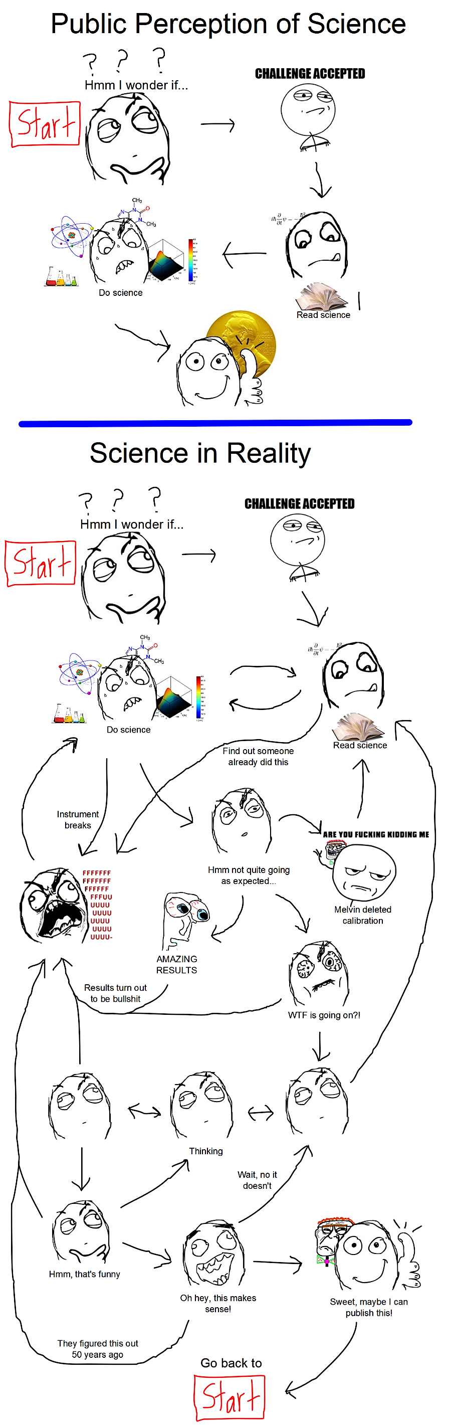
In unrelated but hilarious news, see this comic about doing science courtesy of Reed Walker. (If you're not an active researcher then this probably isn't funny to you, sorry.)

7.11.2011

Asymmetric citation behavior

Our colleague James Rising indirectly pointed me to a PNAS paper from 2008 by Rosvall and Bergstrom that provides a very interesting map of citation structure across the entirety of the sciences [click through for larger versions]:

As noted in the lower right, arrows convey intensity of citation from one field to the next. The structure is very similar to that revealed by eigenfactor.org's plots (previously blogged here; apparently at least one of the authors is involved in the eigenfactor project) albeit with some additional and rather useful dimensionality.

Or particular interest is the social sciences, which Rosvall and Bergstrom map out in detail:

Note how high the flow intensity within economics (circle darkness) is compared to flow outside (circle border), as well as the relative patterns to other fields, almost all of which cite economics more than economics cites them. The pattern is similar though not quite as extreme for psychology. There are a variety of reasons one could imagine for this (rigor of work, differences in strategic citation behavior, range of topics studied, etc. etc.) but it's a pretty nice bit of academic-social network structure to ponder on its own.