5.31.2012
Setting technological goals for political feasibility in US climate legislation
In Nature Climate Change:
Willingness to pay and political support for a US national clean energy standard
Joseph E. Aldy, Matthew J. Kotchen & Anthony A. Leiserowitz
Abstract: In 2010 and 2011, Republicans and Democrats proposed mandating clean power generation in the electricity sector. To evaluate public support for a national clean energy standard (NCES), we conducted a nationally representative survey that included randomized treatments on the sources of eligible power generation and programme costs. We find that the average US citizen is willing to pay US$162 per year in higher electricity bills (95% confidence interval: US$128–260), representing a 13% increase, in support of a NCES that requires 80% clean energy by 2035. Support for a NCES is lower among non-whites, older individuals and Republicans. We also employ our statistical model, along with census data for each state and Congressional district, to simulate voting behaviour on a NCES by Members of Congress assuming they vote consistently with the preferences of their median voter. We estimate that Senate passage of a NCES would require an average household cost below US$59 per year, and House passage would require costs below US$48 per year. The results imply that an ‘80% by 2035’ NCES could pass both chambers of Congress if it increases electricity rates less than 5% on average.
5.29.2012
Disease and Development: Some Notable Recent Findings
[This is a guest post by first year students in Columbia's Sustainable Development program]
As part of their coursework for the Human Ecology course, first years in Columbia's Sustainable Development Ph.D. program (and a few select students from the SIPA Masters programs) were asked to put together reviews of recently active areas of the broad environment/development literature. Anna Tompsett, the course's TA and sometimes guest blogger on FE, has asked the students permission to share them with us, so over the next two weeks we'll be posting them, starting with today's on disease and development. Enjoy!
Disease and Development: Some Notable Recent Findings
One
of the most formidable impediments to sustainable development in low-income
countries is disease. In an attempt to offer a rough sketch of the current
state of research in this realm, we canvassed the past year’s worth of issues
of three major journals—Nature, Lancet, and the New England Journal of Medicine—and picked out six articles that we
found particularly relevant to disease, development, and global health policy.
We
were especially interested in health issues that rate among the World Health
Organization’s leading causes of death and global burden of disease in developing countries. (Global burden of disease
measures years of healthy life lost to disability as well as death.) We
selected studies based on the number of people that could benefit from the
findings, out-of-sample validity (in the case of experimental studies),
socioeconomic aspects, and potential policy implications.
5.26.2012
Weekend Links
1) The importance of stupidity in science (via Colleen)
2) Average annual decline in under 5 mortality in selected SSA countries since 2005: 5.9% (via Mark)
3) Child mortality in the Millennium Villages: a non-randomized controlled assessment (The Lancet, via Amir)
4) Understanding basic weather phenomena in a few short pages
5) Whatever happened to the Journal of No Results? (via Gordon)
6) The Rise and Fall of Unions in the U.S., or "The Fastest-Dying Jobs of This Generation" (NBER, via Dave Pell)
5.21.2012
Empirics and modeling of climate adaptation
I, very regrettably, had to miss this workshop at the NBER last week. But it looks like it was terrific. Several papers review the empirical or modeling literature on adaptation in a variety of sectors. Many of the reviews are incomplete drafts, but collectively they already represent a trove of useful and important information. Papers are linked in the program:
Integrated Assessment Modeling Conference
Karen Fisher-Vanden, David Popp, and Ian Sue Wing, Organizers
May 17-18, 2012
5.19.2012
Association of Coffee Drinking with Total and Cause-Specific Mortality
 |
| Image credit: Mighty Optical Illusions (moillusions.com) |
Association of Coffee Drinking with Total and Cause-Specific Mortality
Freedman et al., NEJM 2012
In this large, prospective U.S. cohort study, we observed a dose-dependent inverse association between coffee drinking and total mortality, after adjusting for potential confounders (smoking status in particular). As compared with men who did not drink coffee, men who drank 6 or more cups of coffee per day had a 10% lower risk of death, whereas women in this category of consumption had a 15% lower risk. Similar associations were observed whether participants drank predominantly caffeinated or decaffeinated coffee. Inverse associations persisted among many subgroups, including participants who had never smoked and those who were former smokers and participants with a normal BMI and those with a high BMI. Associations were also similar for deaths that occurred in the categories of follow-up time examined (0 to <4 years, 4 to <9 years, and 9 to 14 years).
Our study was larger than prior studies, and the number of deaths (>52,000) was more than twice that in the largest previous study. Whereas the results of previous small studies have been inconsistent, our results are similar to those of several larger, more recent studies, including the Health Professionals Follow-up Study and the Nurses' Health Study.
[...]
Given the observational nature of our study, it is not possible to conclude that the inverse relationship between coffee consumption and mortality reflects cause and effect. However, we can speculate about plausible mechanisms by which coffee consumption might have health benefits. Coffee contains more than 1000 compounds that might affect the risk of death. The most well-studied compound is caffeine, although similar associations for caffeinated and decaffeinated coffee in the current study and a previous study suggest that, if the relationship between coffee consumption and mortality were causal, other compounds in coffee (e.g., antioxidants, including polyphenols) might be important.
In summary, this large prospective cohort study showed significant inverse associations of coffee consumption with deaths from all causes and specifically with deaths due to heart disease, respiratory disease, stroke, injuries and accidents, diabetes, and infections. Our results provide reassurance with respect to the concern that coffee drinking might adversely affect health.Please feel free to discuss feasible instruments for coffee consumption in the comments (or not). (via bb)
5.18.2012
Plotting a two-dimensional line using color to depict a third dimension (in Matlab)
I had seen other people do this in publications, but was annoyed that I couldn't find a quick function to do it in a general case. So I'm sharing my function to do this.
If you have three vectors describing data, eg. lat, lon and windspeed of Hurricane Ivan (yes, this data is from my env. sci. labs), you could plot it in 3 dimensions, which is awkward for readers:

or using my nifty script, you can plot wind speed as a color in two dimensions:

Not earth-shattering, but useful. Next week, I will post an earth-shattering application.
[BTW, if someone sends me code to do the same thing in Stata, I will be very grateful.]
Also, you can make art:

Help file below the fold.
5.17.2012
Capital with a capital "C"
There is capital and then there is Capital. These are some interesting recent NBER papers on the latter.
Railroads and American Economic Growth: A "Market Access" Approach
Dave Donaldson and Richard Hornbeck
Abstract: This paper examines the historical impact of railroads on the American economy. Expansion of the railroad network and decreased trade costs may a ect all counties directly or indirectly, an econometric challenge in many empirical settings. However, the total impact on each county can be summarized by changes in that county's "marketaccess," a reduced-form expression derived from general equilibrium trade theory. We measure counties' market access by constructing a network database of railroads and waterways and calculating lowest-cost county-to-county freight routes. As the railroad network expanded from 1870 to 1890, changes in market access are capitalized in agricultural land values with an estimated elasticity of 1.5. Removing all railroads in 1890 would decrease the total value of US agricultural land by 73% and GNP by 6.3%, more than double social saving estimates (Fogel 1964). Fogel's proposed Midwestern canals would mitigate only 8% of losses from removing railroads.
ON THE ROAD: ACCESS TO TRANSPORTATION INFRASTRUCTURE AND ECONOMIC GROWTH IN CHINA
Abhijit Banerjee, Esther Duflo, Nancy Qian
This paper estimates the effect of access to transportation networks on regional economic outcomes in China over a twenty-period of rapid income growth. It addresses the problem of the endogenous placement of networks by exploiting the fact that these networks tend to connect historical cities. Our results show that proximity to transportation networks have a moderate positive causal effect on per capita GDP levels across sectors, but no effect on per capita GDP growth. We provide a simple theoretical framework with empirically testable predictions to interpret our results. We argue that our results are consistent with factor mobility playing an important role in determining the economic benefits of infrastructure development.
ENGINES OF GROWTH: FARM TRACTORS AND TWENTIETH-CENTURY U.S. ECONOMIC WELFARE
Richard H. Steckel and William J. White
The role of twentieth-century agricultural mechanization in changing the productivity, employment opportunities, and appearance of rural America has long been appreciated. Less attention has been paid to the impact made by farm tractors, combines, and associated equipment on the standard of living of the U.S. population as a whole. This paper demonstrates, through use of a detailed counterfactual analysis, that mechanization in the production of farm products increased GDP by more than 8.0 percent, using 1954 as a base year. This result suggests that studying individual innovations can significantly increase our understanding of the nature of economic growth.
5.14.2012
Was there a trend break when Noah built his Ark?
I just sifted through a 700-entry bibliography, and this was the coolest paper I found (2008, PNAS). It definitely wins the FE-paper-find-of-the-month award. I don't have the patience to carefully track population changes in rodent communities for 30 years (!), but I'm really excited to see the results when someone else does.
Impact of an extreme climatic event on community assembly
Katherine M. Thibault and James H. Brown
Abstract: Extreme climatic events are predicted to increase in frequency and magnitude, but their ecological impacts are poorly understood. Such events are large, infrequent, stochastic perturbations that can change the outcome of entrained ecological processes. Here we show how an extreme flood event affected a desert rodent community that has been monitored for 30 years. The flood (i) caused catastrophic, species-specific mortality; (ii) eliminated the incumbency advantage of previously dominant species; (iii) reset long-term population and community trends; (iv) interacted with competitive and metapopulation dynamics; and (v) resulted in rapid, wholesale reorganization of the community. This and a previous extreme rainfall event were punctuational perturbations—they caused large, rapid population- and community-level changes that were superimposed on a background of more gradual trends driven by climate and vegetation change. Captured by chance through long-term monitoring, the impacts of such large, infrequent events provide unique insights into the processes that structure ecological communities.
.jpg)
5.12.2012
Weekend Links
1) Bertrand Russel's Ten Commandments of teaching
2) NYT on Dick Lindzen, cloud feedbacks, and denialists (via Dave Pell)
3) "The iPhone has turned out to be one of the most revolutionary developments since the invention of Braille." (also via DP)
4) Should blogging count towards tenure decisions? (Robin Hanson, via Krista)
5) "Observed acceleration indicates that sea level rise from Greenland may fall well below proposed upper bounds" (Science, via Kyle)
6) Pakistan is going to roll out mandatory natural hazard insurance for all citizens (via Amir)
7) Google Refine, for cleaning messy data (via Nicole)
8) "A Structure for Deoxyribose Nucleic Acid" was published 50 years ago last month. It's quite readable. (via bb)
9) A novel strategy for the prisoner's dilemma under non-simultaneous signalling and bequests.
5.11.2012
How much groundwater does Africa have?
Quantitative maps of groundwater resources in Africa
A M MacDonald, H C Bonsor, B É Ó Dochartaigh and R G Taylor
Abstract: In Africa, groundwater is the major source of drinking water and its use for irrigation is forecast to increase substantially to combat growing food insecurity. Despite this, there is little quantitative information on groundwater resources in Africa, and groundwater storage is consequently omitted from assessments of freshwater availability. Here we present the first quantitative continent-wide maps of aquifer storage and potential borehole yields in Africa based on an extensive review of available maps, publications and data. We estimate total groundwater storage in Africa to be 0.66 million km3 (0.36–1.75 million km3). Not all of this groundwater storage is available for abstraction, but the estimated volume is more than 100 times estimates of annual renewable freshwater resources on Africa. Groundwater resources are unevenly distributed: the largest groundwater volumes are found in the large sedimentary aquifers in the North African countries Libya, Algeria, Egypt and Sudan. Nevertheless, for many African countries appropriately sited and constructed boreholes can support handpump abstraction (yields of 0.1–0.3 l s−1), and contain sufficient storage to sustain abstraction through inter-annual variations in recharge. The maps show further that the potential for higher yielding boreholes ( > 5 l s−1) is much more limited. Therefore, strategies for increasing irrigation or supplying water to rapidly urbanizing cities that are predicated on the widespread drilling of high yielding boreholes are likely to be unsuccessful. As groundwater is the largest and most widely distributed store of freshwater in Africa, the quantitative maps are intended to lead to more realistic assessments of water security and water stress, and to promote a more quantitative approach to mapping of groundwater resources at national and regional level.
 |
| Click to enlarge. Copyright ERL |
See related field experiment on valuing ground water protection here.
h/t Kyle
5.09.2012
AGU Science Policy Recap
5.08.2012
Read this book!
 So you have an extra 23 dollars and a few hours to fill? My recommendation: change your life and read this book.
Steven Gaines recommended "Escape from the Ivory Tower" (by Nancy Baron) to me and it has made me a better communicator, a better writer, and probably a better researcher.
Baron is a scientist-turned-science-writer and puts together a quick read that helps us awkward and detail-oriented scientists pretend that we are smooth operators doing research that everyone should care about.
The book basically has two components. First, she helps you understand how journalists, policy-makers and normal humans see the world and, more importantly, how they think about scientific research. This alone helped me dramatically improve how I frame my work.
Second, she then lays out a whole bunch of practical tools to help you think through how you should present your research, from how to structure a paper summary to how to handle telephone/TV interviews and what to expect when talking with policy-types.
And since Baron is a pro on writing, the book is an unsurprisingly snappy and entertaining read full of excellent quotes.
I can't recommend this book enough. If I ever get the chance to teach a class on research methodology, I swear that I will require that everyone read this book.
Other books in the make-yourself-a-better-communicator series: graphics and climate.
5.07.2012
Job placements (2012) for Columbia University's Sustainable Development PhD program
Apparently there are fantastic jobs for people with doctorates in Sustainable Development (who knew?). New placements this year:
Ram Fishman will begin as an assistant professor of economics and public policy at George Washington University.
Geoffrey Johnston will be starting a post doc at Johns Hopkins doing malaria modeling.
Ram Fishman will begin as an assistant professor of economics and public policy at George Washington University.
Geoffrey Johnston will be starting a post doc at Johns Hopkins doing malaria modeling.
Jesse Anttila-Hughes (yes, our Jesse) will begin an appointment as an assistant professor of economics at the University of San Francisco.
Mark Orrs will begin as a professor of practice in sustainable development at Lehigh University.
Mark Orrs will begin as a professor of practice in sustainable development at Lehigh University.
I (Sol Hsiang) be joining Jesse in the bay area in Fall 2013 as an assistant prof. of public policy at Berkeley.
 |
| Fight Entropy is moving to San Francisco! |
5.03.2012
Rockefeller 2012 Innovation Challenges
Anna points out that the Rockefeller Foundation (yes, that Rockefeller Foundation) has announced its 2012 Innovation Challenges. They plan on awarding up to nine grants of up to $100K for research proposals on the three following FE-appropriate topics:
- Decoding Data - How will you use data to create change that improves the quality of life of poor or vulnerable communities in cities?
- Irrigating Efficiency - How will you improve or scale agricultural water use efficiency?
- Farming Now - How will your idea encourage and support young people to enter and stay in farming?
4.30.2012
Why visualizing instrumental variables made me less excited about it
Instrumental variables (IV and 2SLS) is a statistical approach commonly used in the empirical social sciences ("instrumental variables" has > 84,000 hits on google scholar) but it often seems to be over-interpreted. I realized this when, as a grad student, I tried to draw a graphical description of what IV was doing. Ever since, I've never bothered to estimate IV and only spend my time on reduced form models. These are my two cents.
IV & 2SLS
IV was originally developed to combat attenuation bias in ordinary least-squares, but somebody (I don't know who) realized it could be used to estimate local average treatment effects in experimental settings when not all subjects in a treatment group actually received the treatment of interest. From there, someone figured out that IV could be used in retrospective studies to isolate treatment effects when assignment to treatment had some endogenous component. This last interpretation is where I think a lot of folks run into trouble. (If you don't know what any of this means, you probably won't care about the rest of this post...)
All of these conceptual innovations were big contributions. But what happened afterwards led to a lot of sloppy thinking. IV is often taught as a method for "removing" endogeneity from an independent variable (variable X) in a regression. While strictly a correct statement (if some relatively strong assumptions are met), it often feels as if it's abused. My perception from papers/talks/discussion is that most students interpret IV in a similar way to how they interpret a band-pass filter: if you find a plausible instrument (variable Z), you can "filter out" the bad (endogenous) part of your independent variable and just retain the good (exogenous) part. While a useful heuristic for teaching, its overuse leads to bad intuition.
IV with one instrument
The first stage regression in IV "filters out" all variation in X that does not project (for now, linearly) onto Z. This linear projection is just Z*b, but it is often written as "X-hat". While not mathematically incorrect, and appealing for heuristic purposes, I think that using X-hat as a notational tool is why a lot of students get confused. It makes students think that X-hat is just like X, except without all the bad endogenous parts. But really, X-hat is more like Z than it is like X. In fact, X-hat IS Z! It's just linearly rescaled by b, which is just a change in units. The reason why X-hat is exogenous if Z is exogenous is because
where b is a constant. It seems silly and patronizing to reiterate an equation that is taught in metrics 101 a gazillion times, but people seem to forget that this little rescaling equation is doing all the heavy lifting in an IV model. (I bet that if we never used "X-hat" notation and we renamed "the first stage" something less exciting, like "linearly converting units," then grad students would think IV is much less magical...)
Once X-hat is estimated, it is used as the new regressor in the "second stage" equation
and then a big fuss is made about how a is the unbiased effect of X on Y. But if we drop the X-hat notation and replace it with the rescaled-Z notation, we get something less exciting:
Enough ranting. How do we visualize this? Its as easy as it sounds: you rescale the horizontal axis in your reduced form regression.
To illustrate this, I generated 100 false data points with the equations
Z ~ uniform on [0,1]
X = Z * 2 + e1
Y = X + e2
where e1 and e2 are N(0,1). And then plot the reduced form equation (Z vs. Y) as the blue line in the upper-left panel:

I then estimate the first stage regression in the lower left panel and show the predicted values X-hat as open red circles. In the lower right panel, I just plot X-hat against X-hat to show that I am reflecting these values from the vertical axis (ordinate) to the horizontal axis (abcissa). Then, keeping X-hat on the horizontal axis, I plot Y against X-hat in the upper right panel. This is the second stage estimate from IV, which gives us our unbiased estimate of the coefficient a (the slope of the red line).
[The code to generate these plots in Stata is at the bottom of this post.]
What is different between the scatter on the upper left (blue line, representing the reduced form regression) and the scatter on the upper right (red line, representing the second stage of IV)? Not too much. The vertical axis is the same and the relative locations of the data points are the same. The only change is that the horizontal variable has been rescaled by a factor of two (recall the data generating process above). The IV regression is just a rescaled version of the reduced form. What happened to X? It was left behind in the lower left panel and it never went anywhere else. It only feels like it is somehow present in the upper right panel because we renamed Z*b the glitzier X-hat.
Multiple instruments (2SLS)
Sometimes people have more than one exogenous variable that influences X (eg. temperature and rainfall). Both of these variables can be used as instruments in the first stage. What happens to the intuition above when we do this? Not too much, except things get harder to draw. But the fact that it's harder to draw doesn't mean that the estimate is necessarily more impressive or magical.
Suppose we have now have instruments Z1 and Z2 such that
Multivariate first stage: X = Z1 - Z2
Second stage: Y = 2 * X
then the first stage regression (X-hat) looks like this:

where the two horizontal axes are Z1 and Z2 and the vertical axis is X.
If we substitute this first stage regression into the second stage, we get
We can easily plot this version of Y as a function of Z1 and Z2 (the reduced form). Here, it's the purple plane:


and the reduced form regression of Y on Z1 and Z2 is gives us
which we overlay in purple again:

Since the second stage didn't change, the height of the purple surface is still always twice the distance from zero relative to the green surface (a scatter plot of pink vs. green values would be a straight line with slope = 2 = a). This graph looks fancier, but the instruments Z1 and Z2 are still driving everything. The endogenous variable X only enters passively by determining the height of the green surface. Once that's done, the Z1 and Z2 do the rest.
Take away: Reduced form models can be very interesting. However, instrumental variables models are rarely much more interesting. In fact, all the additional interestingness of the IV model arises from the exclusion restriction that is assumed, but this assumption is usually false (recall: how many papers use weather as an instrument?), so the IV model is probably exactly as interesting as the reduced form, except that it has larger standard errors and the wrong units.
[If you disagree, send me a clear visualization of your 2SLS results and all the steps you used to get there. I'd love to be wrong here.]
IV & 2SLS
IV was originally developed to combat attenuation bias in ordinary least-squares, but somebody (I don't know who) realized it could be used to estimate local average treatment effects in experimental settings when not all subjects in a treatment group actually received the treatment of interest. From there, someone figured out that IV could be used in retrospective studies to isolate treatment effects when assignment to treatment had some endogenous component. This last interpretation is where I think a lot of folks run into trouble. (If you don't know what any of this means, you probably won't care about the rest of this post...)
All of these conceptual innovations were big contributions. But what happened afterwards led to a lot of sloppy thinking. IV is often taught as a method for "removing" endogeneity from an independent variable (variable X) in a regression. While strictly a correct statement (if some relatively strong assumptions are met), it often feels as if it's abused. My perception from papers/talks/discussion is that most students interpret IV in a similar way to how they interpret a band-pass filter: if you find a plausible instrument (variable Z), you can "filter out" the bad (endogenous) part of your independent variable and just retain the good (exogenous) part. While a useful heuristic for teaching, its overuse leads to bad intuition.
IV with one instrument
The first stage regression in IV "filters out" all variation in X that does not project (for now, linearly) onto Z. This linear projection is just Z*b, but it is often written as "X-hat". While not mathematically incorrect, and appealing for heuristic purposes, I think that using X-hat as a notational tool is why a lot of students get confused. It makes students think that X-hat is just like X, except without all the bad endogenous parts. But really, X-hat is more like Z than it is like X. In fact, X-hat IS Z! It's just linearly rescaled by b, which is just a change in units. The reason why X-hat is exogenous if Z is exogenous is because
X-hat = Z * b
where b is a constant. It seems silly and patronizing to reiterate an equation that is taught in metrics 101 a gazillion times, but people seem to forget that this little rescaling equation is doing all the heavy lifting in an IV model. (I bet that if we never used "X-hat" notation and we renamed "the first stage" something less exciting, like "linearly converting units," then grad students would think IV is much less magical...)
Once X-hat is estimated, it is used as the new regressor in the "second stage" equation
Y = X-hat * a + error
and then a big fuss is made about how a is the unbiased effect of X on Y. But if we drop the X-hat notation and replace it with the rescaled-Z notation, we get something less exciting:
Y = Z * b * a + error
Where a is now the unbiased effect of Z on Y, but rescaled by a factor 1/b. For those familiar with IV, this looks a lot like the reduced form equation
Y = Z * c + error
which was always valid because Z is exogenous. Clearly,
a = c / b.
If you're still reading, you should be yawning, since this all seems very boring: these are all just variations on the same reduced form equation. And that's my main point, which I don't think is taught enough: Instrumental variables is only as good as your reduced form, because it is a linear rescaling of your reduced form. Of course, there are adjustments to standard errors, but if you're doing IV to remove bias, then you were focused on your point estimate to begin with. (An aside: it drives me nuts when people are "uninterested" in the reduced form effect of natural variations [eg. weather] on some outcome, but then are fascinated if you use the same variation as an instrument for some otherwise endogenous intermediate variable. The latter regression is the same as the first, only the coefficient has been rescaled by 1/b!)
Enough ranting. How do we visualize this? Its as easy as it sounds: you rescale the horizontal axis in your reduced form regression.
To illustrate this, I generated 100 false data points with the equations
Z ~ uniform on [0,1]
X = Z * 2 + e1
Y = X + e2
where e1 and e2 are N(0,1). And then plot the reduced form equation (Z vs. Y) as the blue line in the upper-left panel:

I then estimate the first stage regression in the lower left panel and show the predicted values X-hat as open red circles. In the lower right panel, I just plot X-hat against X-hat to show that I am reflecting these values from the vertical axis (ordinate) to the horizontal axis (abcissa). Then, keeping X-hat on the horizontal axis, I plot Y against X-hat in the upper right panel. This is the second stage estimate from IV, which gives us our unbiased estimate of the coefficient a (the slope of the red line).
[The code to generate these plots in Stata is at the bottom of this post.]
What is different between the scatter on the upper left (blue line, representing the reduced form regression) and the scatter on the upper right (red line, representing the second stage of IV)? Not too much. The vertical axis is the same and the relative locations of the data points are the same. The only change is that the horizontal variable has been rescaled by a factor of two (recall the data generating process above). The IV regression is just a rescaled version of the reduced form. What happened to X? It was left behind in the lower left panel and it never went anywhere else. It only feels like it is somehow present in the upper right panel because we renamed Z*b the glitzier X-hat.
Multiple instruments (2SLS)
Sometimes people have more than one exogenous variable that influences X (eg. temperature and rainfall). Both of these variables can be used as instruments in the first stage. What happens to the intuition above when we do this? Not too much, except things get harder to draw. But the fact that it's harder to draw doesn't mean that the estimate is necessarily more impressive or magical.
Suppose we have now have instruments Z1 and Z2 such that
Multivariate first stage: X = Z1 - Z2
Second stage: Y = 2 * X
then the first stage regression (X-hat) looks like this:

where the two horizontal axes are Z1 and Z2 and the vertical axis is X.
If we substitute this first stage regression into the second stage, we get
Y = 2 * (Z1 - Z2)
We can easily plot this version of Y as a function of Z1 and Z2 (the reduced form). Here, it's the purple plane:

The resulting second stage regression would take the observed value for Y (purple) and project it onto the predicted values for X (green). The parameter of interest (2 here, but the variable "a" earlier) is just the ratio of the height of the purple surface to the height of the green surface.
Again, everything can be stated in terms of the instruments Z1 and Z2 (the two horizontal axes), which means the reduced form is again just as good as the second stage. X only enters by determining how steep the green surface is.
Nonlinear first stage with multiple instruments
Finally, some people use a non-linear first stage. Again, this is not terribly different. Suppose we have
Nonlinear multivariate first stage: X = Z1^2 - Z2
Second stage: Y = 2 * X
Then the first stage looks like:

and the reduced form regression of Y on Z1 and Z2 is gives us
Y = 2 * (Z1^2 - Z2)
which we overlay in purple again:

Since the second stage didn't change, the height of the purple surface is still always twice the distance from zero relative to the green surface (a scatter plot of pink vs. green values would be a straight line with slope = 2 = a). This graph looks fancier, but the instruments Z1 and Z2 are still driving everything. The endogenous variable X only enters passively by determining the height of the green surface. Once that's done, the Z1 and Z2 do the rest.
Take away: Reduced form models can be very interesting. However, instrumental variables models are rarely much more interesting. In fact, all the additional interestingness of the IV model arises from the exclusion restriction that is assumed, but this assumption is usually false (recall: how many papers use weather as an instrument?), so the IV model is probably exactly as interesting as the reduced form, except that it has larger standard errors and the wrong units.
[If you disagree, send me a clear visualization of your 2SLS results and all the steps you used to get there. I'd love to be wrong here.]
4.29.2012
Weekend Links
1) Google search -implied discounting correlates with GDP (Nature, open access)
2) GIS and Agent-Based Modeling (via Krista)
3) The first satellite photo of California dates from 1851 (or not)
4) Honesty about effect sizes in development (via Amir)
5) Association of Kawasaki disease with tropospheric wind patterns (Nature)
6) Guess which three developed nations have the highest adolescent death rates? The first one's pretty easy. (via Dave Pell)
7) A table of slightly wrong tables and identities (xkcd)
4.27.2012
An unusual number of goodies in Nature this week
A special Outlook issue reviewing the challenges of malaria control:
 Nature Outlook: Malaria (Open access)
Commentary on the ivory tower:
Global issues: Make social sciences relevant
Luk Van Langenhove
Excerpt:
Meta-analysis of a famous question:
Comparing the yields of organic and conventional agriculture
Verena Seufert, Navin Ramankutty & Jonathan A. Foley
And some interesting agent-based modeling from Nature Climate Change:
Emerging migration flows in a changing climate in dryland Africa
Dominic R. Kniveton, Christopher D. Smith & Richard Black
Fears of the movement of large numbers of people as a result of changes in the environment were first voiced in the 1980s (ref. 1). Nearly thirty years later the numbers likely to migrate as a result of the impacts of climate change are still, at best, guesswork2. Owing to the high prevalence of rainfed agriculture, many livelihoods in sub-Saharan African drylands are particularly vulnerable to changes in climate. One commonly adopted response strategy used by populations to deal with the resulting livelihood stress is migration. Here, we use an agent-based model developed around the theory of planned behaviour to explore how climate and demographic change, defined by the ENSEMBLES project3 and the United Nations Statistics Division of the Department of Economic and Social Affairs4, combine to influence migration within and from Burkina Faso. The emergent migration patterns modelled support framing the nexus of climate change and migration as a complex adaptive system5. Using this conceptual framework, we show that the extent of climate-change-related migration is likely to be highly nonlinear and the extent of this nonlinearity is dependent on population growth; therefore supporting migration policy interventions based on both demographic and climate change adaptation.
Nature Outlook: Malaria (Open access)The war against the malaria parasite has raged for millennia, and still claims hundreds of thousands of lives each year. Resistance is a growing issue — for both the parasite to current therapy, and the mosquito to pesticides. Past attempts to eradicate malaria have failed. What will it take to finally subdue this deadly disease?
Commentary on the ivory tower:
Global issues: Make social sciences relevant
Luk Van Langenhove
Excerpt:
The social sciences are flourishing. As of 2005, there were almost half a million professional social scientists from all fields in the world, working both inside and outside academia. According to the World Social Science Report 2010 (ref. 1), the number of social-science students worldwide has swollen by about 11% every year since 2000, up to 22 million in 2006.
Yet this enormous resource is not contributing enough to today's global challenges, including climate change, security, sustainable development and health. These issues all have root causes in human behaviour: all require behavioural change and social innovations, as well as technological development....
Despite these factors, many social scientists seem reluctant to tackle such issues. And in Europe, some are up in arms over a proposal to drop a specific funding category for social-science research and to integrate it within cross-cutting topics of sustainable development. This is a shame — the community should be grasping the opportunity to raise its influence in the real world....
Today, the social sciences are largely focused on disciplinary problems and internal scholarly debates, rather than on topics with external impact....
The main solution, however, is to change the mindset of the social-science community, and what it considers to be its main goal. If I were a student now, I would throw myself at global challenges and social innovations; I hope to encourage today's young researchers to do the same.
Meta-analysis of a famous question:
Comparing the yields of organic and conventional agriculture
Verena Seufert, Navin Ramankutty & Jonathan A. Foley
Abstract: Numerous reports have emphasized the need for major changes in the global food system: agriculture must meet the twin challenge of feeding a growing population, with rising demand for meat and high-calorie diets, while simultaneously minimizing its global environmental impacts1, 2. Organic farming—a system aimed at producing food with minimal harm to ecosystems, animals or humans—is often proposed as a solution3, 4. However, critics argue that organic agriculture may have lower yields and would therefore need more land to produce the same amount of food as conventional farms, resulting in more widespread deforestation and biodiversity loss, and thus undermining the environmental benefits of organic practices5. Here we use a comprehensive meta-analysis to examine the relative yield performance of organic and conventional farming systems globally. Our analysis of available data shows that, overall, organic yields are typically lower than conventional yields. But these yield differences are highly contextual, depending on system and site characteristics, and range from 5% lower organic yields (rain-fed legumes and perennials on weak-acidic to weak-alkaline soils), 13% lower yields (when best organic practices are used), to 34% lower yields (when the conventional and organic systems are most comparable). Under certain conditions—that is, with good management practices, particular crop types and growing conditions—organic systems can thus nearly match conventional yields, whereas under others it at present cannot. To establish organic agriculture as an important tool in sustainable food production, the factors limiting organic yields need to be more fully understood, alongside assessments of the many social, environmental and economic benefits of organic farming systems.
 |
| Copyright Nature |
And some interesting agent-based modeling from Nature Climate Change:
Emerging migration flows in a changing climate in dryland Africa
Dominic R. Kniveton, Christopher D. Smith & Richard Black
Fears of the movement of large numbers of people as a result of changes in the environment were first voiced in the 1980s (ref. 1). Nearly thirty years later the numbers likely to migrate as a result of the impacts of climate change are still, at best, guesswork2. Owing to the high prevalence of rainfed agriculture, many livelihoods in sub-Saharan African drylands are particularly vulnerable to changes in climate. One commonly adopted response strategy used by populations to deal with the resulting livelihood stress is migration. Here, we use an agent-based model developed around the theory of planned behaviour to explore how climate and demographic change, defined by the ENSEMBLES project3 and the United Nations Statistics Division of the Department of Economic and Social Affairs4, combine to influence migration within and from Burkina Faso. The emergent migration patterns modelled support framing the nexus of climate change and migration as a complex adaptive system5. Using this conceptual framework, we show that the extent of climate-change-related migration is likely to be highly nonlinear and the extent of this nonlinearity is dependent on population growth; therefore supporting migration policy interventions based on both demographic and climate change adaptation.
4.26.2012
Which number from 2011 is bigger: Apple revenue or global insured losses to all weather disasters?
Answer: Apple revenue.
In my line of work, it's good to cultivate a sense of scale for ridiculously large numbers. So when I saw this on MR:
For the quarter, Apple posted revenue of $39.2 billion and net quarterly profit of $11.6 billion...
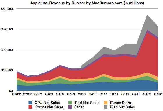 |
| From Macrumors |
I thought, "Wow, that's the same order of magnitude as this:"
 |
| From Swiss Re Sigma |
Except, when integrated across four quarters, Apple is larger (~$100B) than global insured losses to weather (~$60B).
But before you run off thinking that weather isn't costly, remember that only a fraction of all weather losses are insured (probably ~5-15% globally, is my guess, but it's a very hard number to pin down). So global losses to weather are probably substantially larger than Apple's revenue, at least until iPhone 5 is released...
4.25.2012
Background reading on global institutions
Reading about recent cases in the international criminal court, I realized that I don't actually know much about how the court really functions. So I went looking for a primer on the ICC and found something in the "Global Institutions Series" published by Routledge (and subsequently remembered that I wanted to blog this series a while back).
 I discovered this series when I went looking for background reading on how the UNHCR functions. I found this book by Loescher et al (pictured), which gave a comprehensive background of the institution in a concise 130 pages (useful for us busy folk). On the inside flap is a list of other volumes that have been assembled, covering institutions from the WHO and the IMF to the International Olympic Committee (see the complete list here). They seem like an imminently practical resource and I've ordered a few more. I may even end up using some in future classes. (FE readers might be interested in the volume on global environmental institutions, which I found in a free online PDF here). The series began in 2005, so some of the volumes might be missing the most recent debates. But for the historical context of these institutions, many of which formed around mid-century (last century), I don't think that should matter much.
This is the publisher's summary of the series:
The "Global Institutions Series" is edited by Thomas G. Weiss (The CUNY Graduate Center, New York, USA) and Rorden Wilkinson (University of Manchester, UK) and designed to provide readers with comprehensive, accessible, and informative guides to the history, structure, and activities of key international organizations as well as books that deal with topics of key importance in contemporary global governance. Every volume stands on its own as a thorough and insightful treatment of a particular topic, but the series as a whole contributes to a coherent and complementary portrait of the phenomenon of global institutions at the dawn of the millennium.
Books are written by recognized experts, conform to a similar structure, and cover a range of themes and debates common to the series. These areas of shared concern include the general purpose and rationale for organizations, developments over time, membership, structure, decision-making procedures, and key functions. Moreover, current debates are placed in historical perspective alongside informed analysis and critique. Each book also contains an annotated bibliography and guide to electronic information as well as any annexes appropriate to the subject matter at hand.
4.24.2012
Interfacing Water, Climate, And Society: A Resource List
The Research Applications Laboratory at NCAR has a nice wiki-like resource list for folks interested in the interface between water, climate and society. The list isn't comprehensive, but its useful and has sections on:
- Undergraduate Level Degree Programs
- Graduate Level Degree Programs
- Post-graduate Opportunities
- Academic Research Groups
- Professional Development and Research Training
- Professional Networks
- Boundary Organizaions
- Journals
- References
- Funding Programs
- Conferences
Subscribe to:
Posts (Atom)