One of my students found this and showed it to me. (Over the next few weeks, hopefully I'll be able to post much of the material and discoveries from my new course "Spatial Data and Analysis".)

 |
| Hurricane Katrina, as pictured in the Gulf of Mexico at 21:45 UTC on August 28, 2005. |
 |
| This map illustrates the national scope of the dispersion of refugees from Hurricane Katrina. It shows the location by zip code of the 800,000 displaced Louisiana residents who requested federal emergency assistance. The evacuees ended up dispersed across the entire nation, illustrating the wide-ranging impacts that can flow from extreme weather events, some of which are projected to increase in frequency and/or intensity as climate continues to change. (Source: Louisiana Geographic Information Center 2005) |

 In my work, I make a lot of maps. But they're usually just a single image and they're mediocre in terms of color-choice and design. Mapbox is a product from a DC startup that can help us data-jockeys build svelte and scalable maps that integrate data from lots of sources. From their about page:
MapBox is a platform for designing and publishing fast and beautiful maps. We provide MapBox Streets, a complete customizable world base map, develop the powerful open source map design studio TileMill, make it easy to integrate maps into applications and websites, and support all of these tools on top of scalable, high-performance hosting. We've made MapBox developer friendly with an open API.The development team has worked on all sorts of projects, from tracking elections to helping document hurricane damage. Their blog is also way cool.
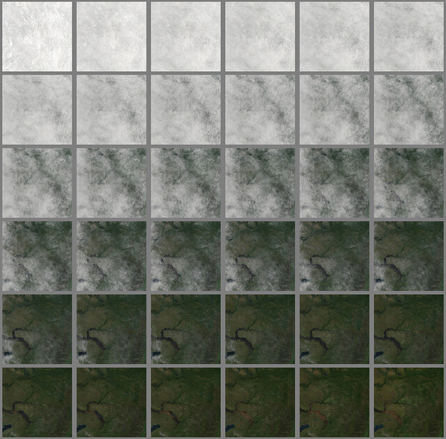
I have been working with Kelly Caylor developing a crowdsourced crop mapping project that is ready for some user testing. I have asked my network of friends to test it a bit, in the hopes that we can see how the system performs, and get some initial data to show at my talk on this project next week at AGU.His instructions:
Hello Friends, I am kindly requesting your help with a research project. Our goal is to use crowdsourcing + google satellite imagery to map crop fields in Africa. We have just developed our prototype, which connects users on Amazon's Mechanical Turk Service to our field mapping interface.
So, if any of you had a few minutes to spare over the next few days and an Amazon account (it's very easy to register as a Mechanical Turk user if you have an account, and not much harder to get an Amazon account if you don't have one), I would be very grateful if you could join up and map a few fields. The link below is to our website, which describes the registration and mapping process further.
This project will be a for-pay endeavor within a few weeks, but for this stage when we are still working out bugs, we are going through Mechanical Turk's testing site (workersandbox.mturk.com), which pays fake money. Once you have registered, please go to sandbox to look for our HITs (Human Intelligence Tasks).
Your help and feedback will be greatly appreciated, both for development purposes and for providing some data that I can include in my presentation on this project (Tuesday in San Fran).
Thanks, Lyndon
http://mappingafrica.princeton.edu/
 |
| Click to enlarge. Copyright ERL |
 |
| Here we show the fraction of the world’s total cropland that is dedicated to growing food crops (crops that are directly consumed by people) versus all other crop uses, including animal feed, fibre, bioenergy crops and other products. Averaged across the globe, 62% of total crop production (on a mass basis) is allocated to human food, 35% for animal feed (which produces human food indirectly, and less efficiently, as meat and dairy products) and 3% for bioenergy crops, seed, and other industrial products. There are striking disparities between regions that primarily grow crops for human consumption (such as Africa, South Asia, East Asia), and those that mainly produce crops for other uses (such as North America, Europe, Australia). Copyright: Nature |

AidData is a collaborative initiative to provide products and services that promote the dissemination, analysis, and understanding of development finance information. At the core of the AidData program is the AidData web portal, which is a gateway to nearly 1 million records of development finance activities from donors around the world. Complementing the work of the OECD, whose Creditor Reporting System (CRS) is the official source of statistics for all OECD member countries, the AidData portal aims to provide access to development finance activities from a wide range of donors in an accessible format. In addition to providing access to these data, the team works on other projects that make it easier to access and analyze aid information, such as geocoding.
In the upcoming Stata Journal I have a paper with a coauthor that lets Stata query Google Maps in order to find latitude and longitude for addresses or other locations, also known as geocoding. What makes this useful is that you can have weird formatting, spelling errors, or missing information in your address or location variable and the program can still geocode it as well as Google Maps can place it on a map.
There are a lot of bad maps out there. They lurk in brochures, on company websites, and in magazines. They confuse, they miscommunicate, and they make it hard to learn anything about the world. Sometimes they leave off Sicily. They’re made by people who have to rush against tight deadlines, by people who are pressured by their bosses or clients to make bad design choices because it “looks cool,” and by people who were thrust into map-making jobs without any training.
[...]
We learn a lot from seeing what went wrong in someone else’s experience. I hope to amuse, but also to educate — to help people (myself included) understand what the elements of a good map are. And maybe, just maybe, if people are better able to understand what makes up a bad map, they’ll start demanding better ones.
 |
| The Distribution of Wealth, 1870 |
 |
| Ranking of States by Income, Debt, Literacy, etc, 1880 |